Uptime Kuma, as a living coastal chart
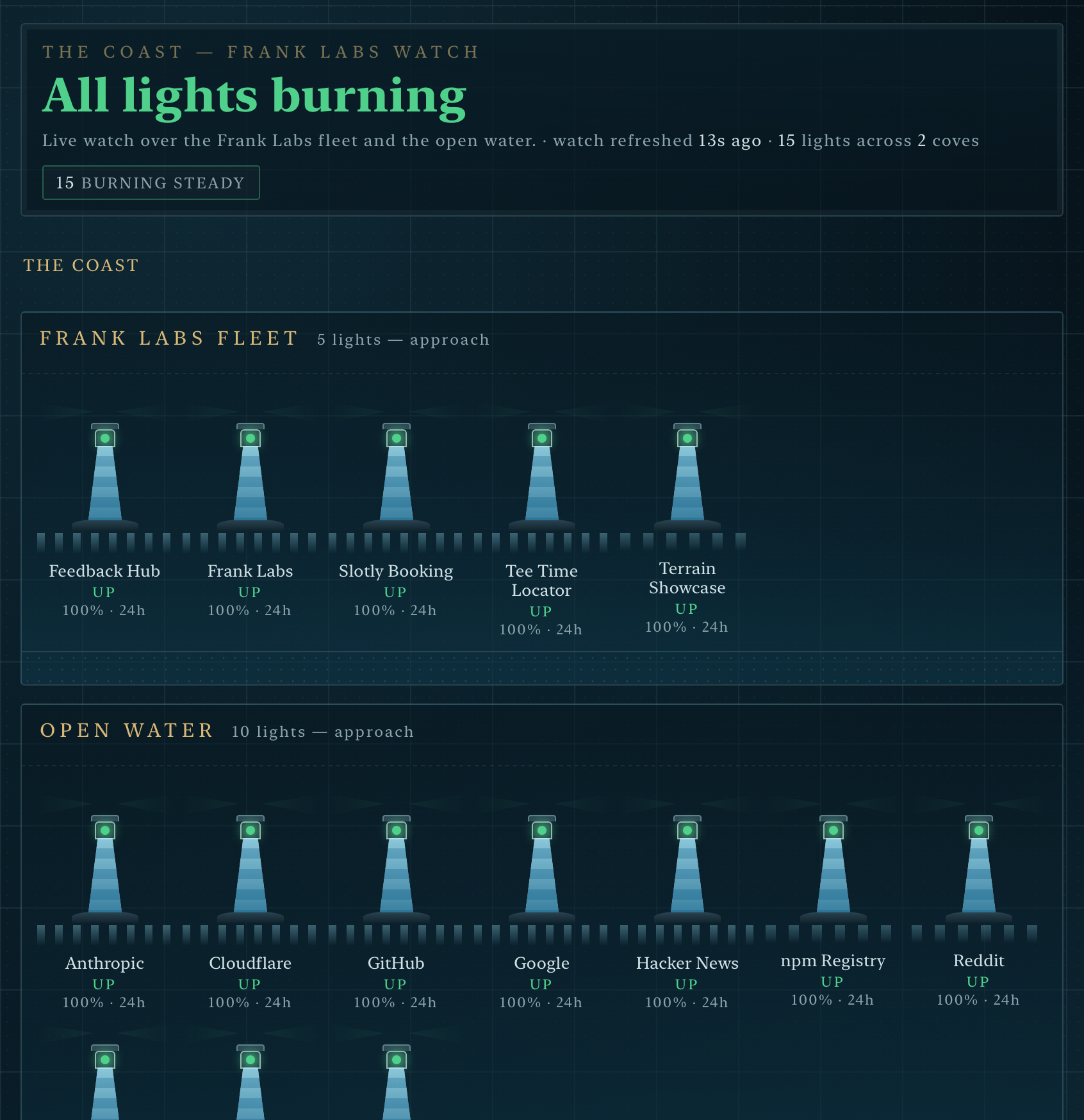
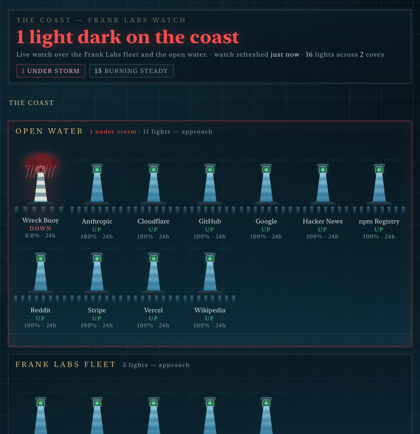
The self-hosted community asked for "Uptime Kuma but with a map." Here it is: every monitor a lighthouse, storms parked over anything down, fog on slow responders, tide marks for 24h uptime. One glance answers the on-call question — where is trouble brewing?
See it live
A real Uptime Kuma instance watches real services behind this chart — the Frank Labs fleet and the open water, refreshing every 60 seconds. (One lighthouse, Wreck Buoy, is deliberately wrecked so you can see weather.)
The live coast — real fleet, real weather The concierge preview (216 synthetic monitors)
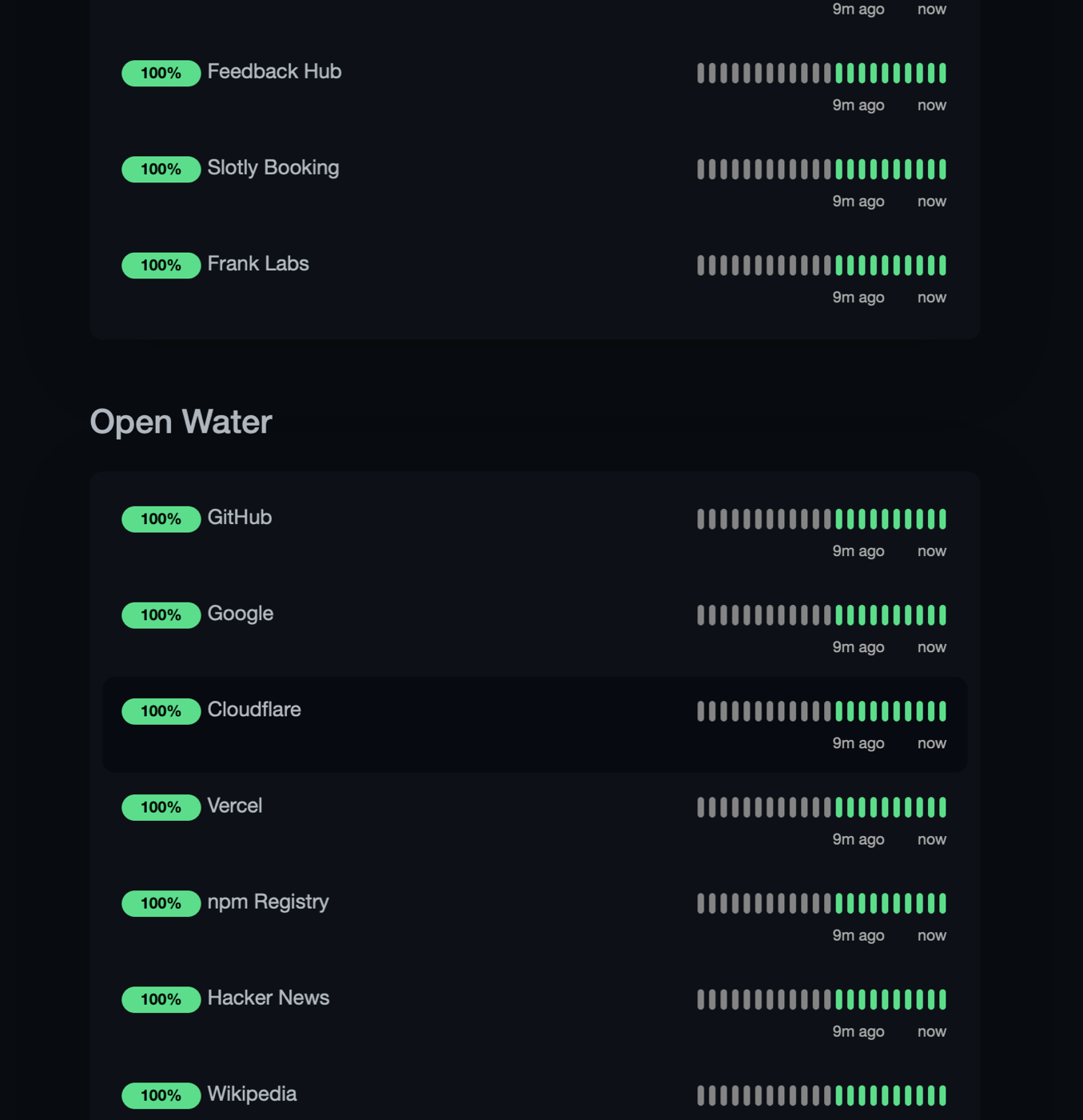
Before · After
See your own coast
If your Kuma instance has a public status page, paste its address. The chart fetches your status-page JSON directly from your browser to your instance — your data never touches our servers.
Requires your instance to allow cross-origin reads (CORS). If it doesn't,
curl -O the chart from
this address and serve it behind
a small proxy that adds an Access-Control-Allow-Origin header on its status-page
JSON — the chart itself explains how, right on the page, under "Survey your own coast."
How this was made — the actual point
Nobody designed this dashboard. npx terrain-scout read the uptime-kuma
repository's shapes — labels, states, vocabulary, never source code — a surveyor
drafted the domain brief, and the terrain generator drew the coast against the status-page
data contract. Same pipeline, any software. Including the internal tool your team scrolls
through forty rows of every morning.
Wire this to your real product The skin on GitHub — MIT The studio
npx terrain-scout · data-terrain-showcase.vercel.app